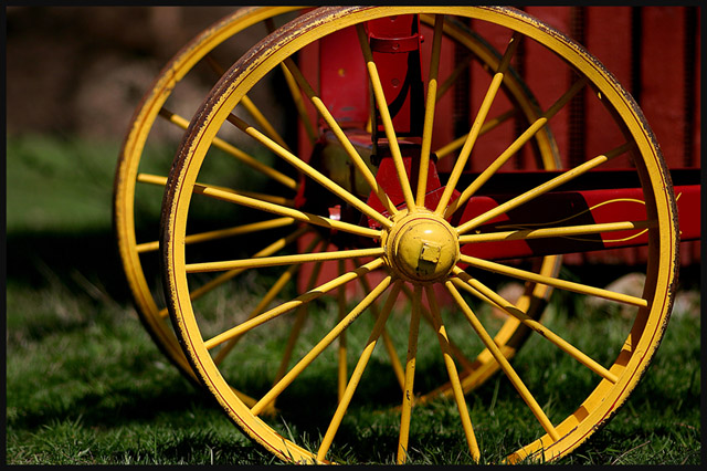
Favourite element of this - the colours. So bright and bold!
Least favourite element - the background. To me, being subjective and probably wrong on this, the Depth of field seems a tiny bit awry, clashing somewhat with the excellent sharpness of the wheel in the foreground. Does that make sense to you? I think the sudden impact of the DOF might have been lessened if it were cropped a little more on the left. Still, it is a good shot, the focus is (rightly) on the wheel... I wonder what the wheels are a part of...? hmmm. 7.
depth of field is confusing here because of the drastic blur for the background on the left, to the slightly blurred background of the red building. I think that with a static background, totally blurred or totally in focus, you would have more continuity. Put the wheel hub into one of the rule of thirds cross-sections and you have a winner. Great subject! 6







 Add photograph to your favorites
 Add photographer to your favorites


 Photographer found comment helpful.


