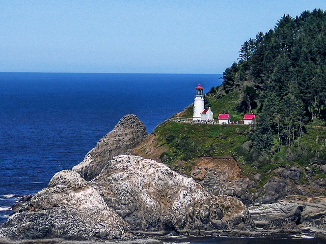
I like the added colour, the houses now pop out of the photo. I would have to agree on the sharpening. Try a history brush set to about 20% 20%, set it to the edit right before the sharpening, and pass it over the trees and rocks until it is faded back to a little bit of blur. Art told me about that nifty little tool :)
AHH- the coast of Maine...great shot, Jeannie- the edit is very nice but a bit "grainy" on my screen- do love the colors ! Nothing like the rocky coast of Maine :)
Nice! The colors and contrast are a big improvement. It might be a bit sharp. I'm no sharpening genius, but on something like this, you might try sharpening it, then fade it to about 80%, to fade the halos and speckles a bit.
I like the richer colors. I was going to suggest that the horizon wasn't level, but it is. I guess it is just an optical illusion. It appears to me that the horizon droop down toward the mountain... but it doesn't. I wonder if this is a normal illusion in images with such an imbalance in weight side to side or with such a lovely strong diagonal through the image. Oh well, it is a very beautiful scene well presented.
This is a superb vacation post card sort of shot. I like the finished image much better for color saturation, however, it seems just a little sharpish in the rocks area to me. Is "sharpish" a word, or did I just make that up? There are a lot of people around the tower.
Wish I could see this place in person.




 Add photograph to your favorites
 Add photographer to your favorites


 Photographer found comment helpful.


