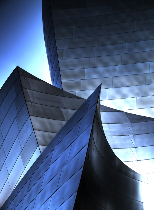
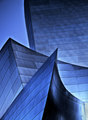
Girlfriend quipped that it looked like a something you'd find on the cover of a math book. I agree.
3 exposures, 1 EV apart.
HDR in Photomatix, noise ninja, that's about it.
Oh yeah, cloned out some stuff where the merge didn't align perfectly (shot freehand).
I wonder how many of you will tear this apart because of the blown highlights...
POST: THANK YOU THANK YOU THANK YOU! You finally like me!
Man, this'll be on my front page for a while, I think.
In response to your notes, I've retooled this shot. I couldn't for the life of me figure out how I got this one quite so dramatic, so this one is a little more subdued, but it fixed the technical issues. Let me know what you think!
Oh, and this one is a little more dramatic-but-fixed.
Statistics
Place: 6 out of 473 Avg (all users): 6.9799 Avg (commenters): 7.3000 Avg (participants): 6.8624 Avg (non-participants): 7.3000 Views since voting: 3806 Views during voting: 282 Votes: 149 Comments: 31 Favorites: 10 (view)
Thanks, I'm glad you think so. I totally agree, but wanted to see if I could fix the 'imperfections.' For the record, I thought the blown highlight added to the image.
Outstanding image from my perspective as a retired architectural photographer. It's simply doing an excellent job of capturing both form and surface in an abstract yet tangible way. Well done. It helps that I know the building, so I realize what you've accomplished.
I really like the lines in this photo. Looked at this image on both my mac and my pc and the only thing that is slightly bothersome to me is the lower right hand corner being to bright. Very minor thought. 9
I really love this, and am only slightly troubled by the hot lower right corner. You might be able to crop in from the right to remove it, and then down from the top to restore the beautifully balance composition. 8
Yeb, that really is applied geometry in its best. Looks like Frank Gehry´s work, Guggeinheim maybe? The burned highlight in the lower right corner are a little anoying though.
I received a PM today asking if this one was mine. So, I have to look at it now to decide if I should reply, "Yes! Isn't it fabulous?!" Wow...truly, I think I terrific job...;-)
Very dramatic and sleek. Love the blue and silver tones. Looks like this could possibly be someone I know. Reminds me of an Emerald City image in my faves.
Goodness it can be so heard to get a different angle (excuse the pun) on an architectural shot like this but you have done so in a wonderful way - Beautiful sharpness lines and colouring 10 from me, good luck
Looks like a hihosilver shot. If it's not mae, then consider it a compliment because I love her shots! Little bit of burn out on the bottom right, but other than that, I really like the lines and the tones of the shot.





 Add photograph to your favorites
 Add photographer to your favorites


 Photographer found comment helpful.


