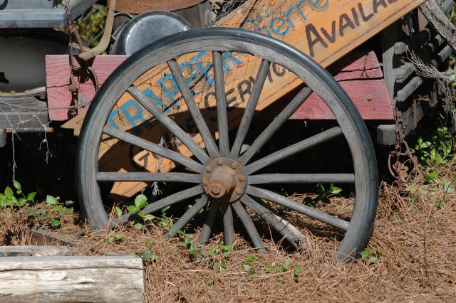
This is a great shot and since I just did the critique on your Serendipity challenge entry I thought I might make some comments on this one as well. I love this shot. One of the best in your portfolio without a doubt. The overall composition is very well done and the cropping is perfect to me.
What it is lacking is contrast or something that really makes it pop out of the screen to me. The colors look flat and boring, a touch of post processing to help bring them out just a touch more could really make a difference. Hope this helps!
Hi, this is a dead centered composition and doesn't work for the rule of thirds. The picture is well exposed. Try a different angle next time. Yours, Jan
i like the soft colours... but the wheel is too centered; try to avoid that in the future, also try to put more meaningness in the title... personify the wheel, make of it a character in the story of your photo
A very nice photo but I kept getting distracted by what was behind the wheel. I wanted to see either a little more of the words that were painted on the wagon of a little less. In the end the wheel is fighting to be the main feature of the photo.





 Add photograph to your favorites
 Add photographer to your favorites

 Photographer found comment helpful.


