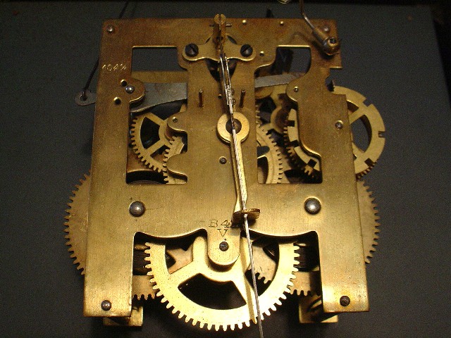
Good idea, but the object the clock is resting on ends in the top-right-hand corner. Also, I don't like the flash making it brighter and the bottom. Rating: 7
-singe
Looks a bit grainy, I downloaded your picture and used neatimage on it, the picture looks much better now. I think that the picture is overexposed on the bottom and a bit to dark at the top.
Interesting, but doesn't make me interested (if that makes sense), maybe a tighter crop on the wheels without showing the space to the sides would help, would also help the lighting problems.






 Add photograph to your favorites
 Add photographer to your favorites


 Photographer found comment helpful.


