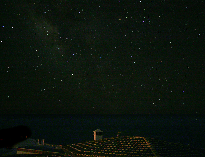
Adjusted curves to enhance stars and bring up the house lighting a bit. Burned porch light which was overly bright and distracting. Crop, resize, unsharp mask, save for web.
Statistics
Place: 24 out of 46 Avg (all users): 5.8568 Avg (commenters): 6.2941 Avg (participants): 5.5185 Avg (non-participants): 5.8819 Views since voting: 994 Views during voting: 677 Votes: 391 Comments: 18 Favorites: 0
Yikes! It looks like I need to recalibrate my monitor. After uploading this and viewing it on another monitor, much more detail was visible, including more noise as well as my poor job of burning the porch light at the lower left. This is not a composite - just a bad masking job while using adjustment layers on the sky and foreground.
Yes, composites are fine for this challenge, but IMHO this one is too obvious. There is a perfectly striate line between sky and foreground. Its a nice try, I love the the galaxy for example, but you could have done better.





 Add photograph to your favorites
 Add photographer to your favorites


 Photographer found comment helpful.


