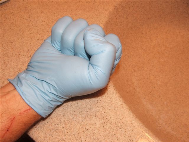
I think converting this to a high contrast bw would have made it more compelling. As it is, the skin tones and the sink (?) are a bit too close in color tones. The blue glove is a nice contrast, though.
I've considered this image for a whopping several minutes...brace yourself...I don't think this image is very good. I get the concept of the subject. DOF is poor. Lighting is too harsh. Composition does nothing to represent the partnership of a hand and glove in an intriguing fashion. This particularly subject would need more environmental context to make it interesting. 3
This shot just doesn't do anything for me, the lighting could be a little better - try playing with the exposure settings in whatever photo editing program you use.







 Add photograph to your favorites
 Add photographer to your favorites


