i like it
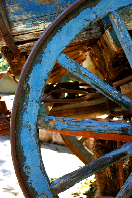
it's kind of chopped; i would have liked to see more of the wheel... but i like it... and u could have thought of a better title for it, more creative
The composition is right on. The blue and red colors work well, but the overpowering hot white in the background really detract. Also, since the blue wheel and spokes are parallel to the focal plane, I'd suggest opening up and making the upper background just a wash of color without detail.
;light is coming from the wrong angle - the backgound is too bright, blown out, while the nice blue wheel sits in strong shadow and comes across as low contrast and dull
this is a great image.... good photoshop work too. Now think if you would have taken the picture from the other side, the sunny side... it would be a little tricky to get your shadow out of the way, but the extreamly light background kinda takes focus away from the picture...






 Add photograph to your favorites
 Add photographer to your favorites


 Photographer found comment helpful.


