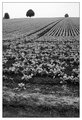
I like this b&w version much more than the color. This version causes me to focus more on the textures and lines of the barley, more visually interesting this way. We just need some hops and we can make us some beer!
OK - I am goign to go against the grain (pun intended). I think this is better in color. The color version just has a more natural feel and flow. The b&w just doesnt feel alive to me. The color one does. When yo get back can you send me a large version of your original? It looks like it would be a fun image to play with.
Barley, grown for brewing in Europe. Quite often used in a symbolic way in paintings and photos. Suggest harvest festival, the gathering in, pastoral life, religion. And poppies in the field of life also suggest to me, as a European, Flanders Fields.
This is a great shot - I didn't notice the poppies at first (in thumbnail looks like a bird to me). I like erikv's idea - selective desat could look really neat
The wheat really makes great patterns -- nicely done. For the fun of it you might try selective desaturation of everything except the poppies -- this could make the wheat and the poppies both really pop at the same time.






 Add photograph to your favorites
 Add photographer to your favorites


 Photographer found comment helpful.


