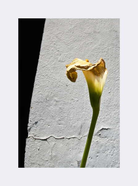
This is a fairly simple edit. Just selected out the dark areas and made them black.
Then selected out the gray areas and accentuated the roughness of the concrete
Finally selected out the lily and made it lighter. All with curves.
Decided on a crop - I'm still not sure that's the final crop but I wanted the crack in
the concrete and the dead lily top in there somewhere.
Put a tiny orange (5 pixel) border and a one inch light gray frame around it.
Oh, really nice minimalistic shot! I too like the off-centered look of the composition. Cropping it down really created visual interest. Darkening the shadow and having the deep shadow appear on the far left hand side of the composition increased the visual impact for I think of a 'stage curtain' being pulled off to one side to reveal this aging lily. The crack in the wall also serves to draw the eye to the dying flower (not to mention it can also be symbolic in imagery of death/dying/broken). Nice going with increasing the contrast in the wall so that the rough texture pops out nicely! Hmmm, a nice contrast with the elements that symbolize of aging/death/decay/erosion would be to select the stem of the lily and boost brightness/contrast and/or saturation/color lvls so that the green is more evident. The juxtaposition of green being a symbol for renewal and the other symbols of aging/decay would make for an interesting visual composition. You have a nice clean minimalistic photo here and thin black line would help the photo pop a bit more off of the white border.
I like the edit to acheive what you were after. I liked the before cropping but I think it was because it was bordered in that odd way with black on both sides. You got exactly what you were going for with this crop though, IMO :)
great contrasty image .. love the living flower against the concrete & the different textures and the feeling that its growing 'against all odds' .. lovely alice .. :)
I quite like this edit and particularly the crop. Bold, and isolates what you were after - the crack, the lily, the strength of the dark and light background. The wide border suits it well, too.




 Add photograph to your favorites
 Add photographer to your favorites

 Photographer found comment helpful.


