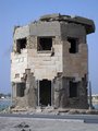
From the critique thread: Issues with this shot include lack of sharpness, lack of contrast. Just because it was suggested by the OP, I worked up an edit to show where I would have went with this shot in PP to give it some pop. Obviously I introduced banding in the sky by working on the small image... but here it is:
Commenting for the critique thread - clearly you got slammed for the DNMC.
In a relevant challenge I would probably score this 5-6 depending on the strength of the competition.
It tells a story, but is clearly focussed very tightly. A wider angle view of the destruction might give a broader context.
As to this particular composition, the very bottom of the shot has some rocks that distract - a quick clone of at least the lower ones would help but that's almost insignificant. Maybe a high contrast (even HDR) black and white might be more impactive.
The shot also seems to lack a bit of clarity (especially around the top of the building) but that may be because I am viewing on an iPad currently.
While both photos are good, I prefer the original edit much better. The subject matter, and title, beg the viewer to consider what the building is/was used for. Was it a sniper tower? Or just another architectural casualty of war? Unfortunately, the idea behind the photo is too abstract for many challenge it was in. I say unfortunate, because this photo certainly did not deserve brown.
Going outside the box sometimes has it's price as far as scoring goes, but the fact is, this photo deserves at least a five.
I never got the chance to vote in this challenge but, Personally I see a seven.
:)
There must be one hell of a story behind all that damage.
I have to tell you, I didn't see the mask here originally. Reinforces my decision to not vote on shots that I don't feel meet the challenge. I was wrong! I commend you for your very creative interpretation of the challenge.
Hmm, not a mask, not a person wearing a mask, not makeup looking like a mask, I cannot say this, exactly meets the challenge even loosely sorry. On the plus side the image is technically good, clear, good color.
"Find or create a mask, and photograph someone wearing it this week." I had to count off for the 'no wearing' part... but I see the point of your image. Perhaps a bit more contrast?
Challenge description: "We're talking about physical masks here, things people put on (or paint on) to hide some or all of their faces."
So your image is DNMC beyond any doubt. Just wait for the next challenge if you don't have an image that meets the current one. Submitting DNMC images is a hassle for everyone.
Did you read the challenge description? Sorry but this is a big stretch for me.
"We're talking about physical masks here, things people put on (or paint on) to hide some or all of their faces. They can be elaborate, even baroque, or they can be simple and clean. Find or create a mask, and photograph someone wearing it this week."
Poignant image, but unfortunately, this challenge was about facial masks not figurative ones. Still, with a little sharpening and some curves adjustment, this would make an even more powerful photo-journalistic image.





 Add photograph to your favorites
 Add photographer to your favorites


 Photographer found comment helpful.