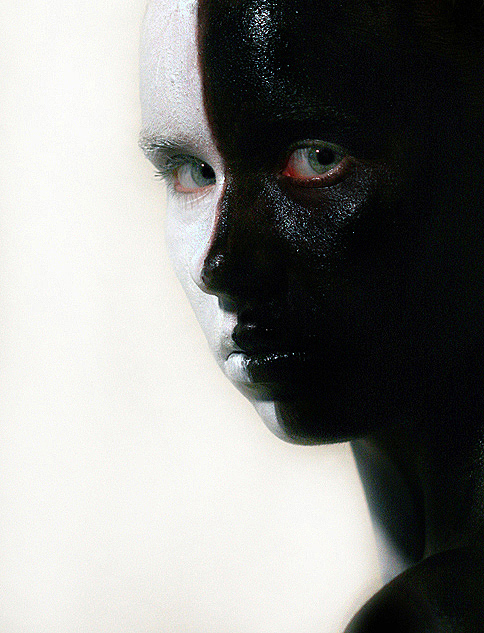
Great potential here, but I think I'd have been tempted to up the whiteness / brightness of the background so that the face merged, leaving the eye alone from that side of the face.
First thing I notice is how you missed some of the paint in the central line so your skin shows through. Also, if you'd smoothed the paint a bit out (or just used the spot healing brush) on the lumpy parts it would have made it look a lot more 'organic' I suppose.
Second thing I notice is the sort of yellowy tinge around your face. You could have fixed this easily but didn't, and I would have marked it down for this as it's a simple oversight. To fix this, there's a number of ways: carefully dodge the area at around 40% or so on a different layer and erase the parts of the face you blow out because of it; make a levels layer to lighten it; or hell, just use a white brush. Easy, but ignored.
Third thing that gets me is the red around the eyes. Maybe its very irritating paint but it isn't the best look. You could have fixed this in PS by changing the colour of the reds to something a bit nicer looking or by making them black/white in PS also, this could have been done by selectively desaturating it i guess (easiest way).
4- the eyes... they don't really stand out enough. You can see them, but they should always be the focal point of a portrait, and in this they're not impactive enough to really make me look twice at the picture. It's nice enough but the eyes are the key and usually deserve special attention.
On a sidenote i'm not too sure why you went with this pose, it kind of diminishes the effect of having 2 seperate sides to the face. I'm sure you had your reasons but I would have just gone for a full frontal face look, possibly with the head down a bit, eyes looking up to accentuate the eyes (and done what I suggested before), and then probs boosted the ocntrast to make it look a bit more lively and give it a bit of a kick up the arse.
I would have given this a 4, or maybe a 5, not because it's a bad picture but because the potential was seemingly ignored and could have been rectified with more thought and self-critique... not to say it ignored, but i'm a cynical bastard.
Sorry if that came across as harsh and dismissive but thats what I think and thought you would prefer something honest and possibly cutting to the usual "wow, nice job" stuff that is nice, but doesnt help.
I see a ribbon in your future -- or at least a top 10 here. Terrific. An eight for you.
Thought this would do better. The black makes a convincing profile -- I think some folks missed that. Still a respectable finish and a new personal best, so congrats!
It is interesting that I've come back to this photo several times and stared at it but felt for a lack of words. It seems to remind me of something from my childhood yet I cannot quite grasp the memory. It seems a little troubling to me I'm not sure why, maybe it is the memory maybe the gaze. She looks like she is looking right into me. Lighting and color seem good, the reflection off the black paint is a bit distracting I think. Only other thing is the tiny gap between the two colors. Still a good image. :)
I'm getting a bit tired of the painted faces... but this is a really good one. The expression and the shininess... good stuff :)
The background color was a good choice. I would have cropped just a tad bit off of the top to emphasize the eyes more... but your average is probably higher than mine, so I'll bow to your decision. *grin*
love the face painting and the crop and the pose. I wish the highlights weren't quite so strong on the forehead and under the eye. while it does help shape the head and face, I find it just a little too harsh.
great effort - since this was an advanced editing you could have really cleaned up a few smudges (on the lip and right forehead) I personally would have matted both the black and white to a really flat finish, then brought the whiteness of your eyes up. It's a great photo but it's not a home run for me. best of luck.
I'm not comfortable with the angle of your model's head. It looks a little forced/stiff. Light also seems too harsh with all the shine over the black make-up. More diffusion maybe? Or even some more light coming from lower-right... Don't know, but something's not quite right. Big help, aren't I? :D Good luck!





 Add photograph to your favorites
 Add photographer to your favorites

 Photographer found comment helpful.


