*Critique Club*
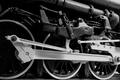
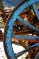
I like the 'color'. Definately works with an old subject like this. I do think that there are a few blown out hot spots in the shot that are a bit distracting. I think most are inthe sky and on that white 'sack?' that is on the back of the train. Focus and clarity are great. very nice detail on the train. I would maybe like to see this backed up a bit though, maybe not such a tight crop on the sides? I'd have to see it to really say if I thought it made it better or not, but I think it is definately cropped off close on the right side. I think you picked an interesting subject, and not just a common wheel, and to that you peeked interest, and also with the details. maybe not something I would personally hang on my wall, however, I think that it is well done. ~Heather~
I like it a lot. Good choice for the muted color pallette. Composition is technical, yet appealing. Focus is immedately drawn to the wheel, yet the eye wanders to other interesting things in the image (but always back to the wheel--good eye direction). Image quality suffers a little on the bottom left portion of the wheel with some jaggies, but I think that is just the medium with which we're working here (darned pixels).






 Add photograph to your favorites
 Add photographer to your favorites

 Photographer found comment helpful.


