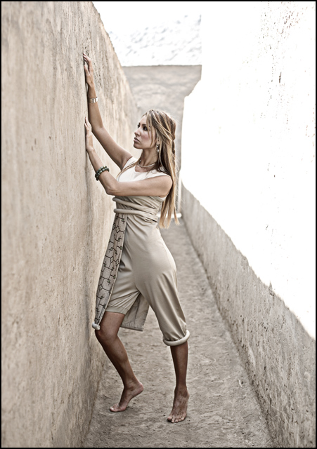
No expert, but I think a couple of things may have caused the sub-5 votes. First, the washout in the upper right 1/4 of the shot. Second, the shot lacks the ultra-crispness of focus on subject. Third, the feeling of distance from the subject - I feel like I'm looking at the scene, and not drawn into it. I didn't vote on your shot, but for me, it is very nice. I love the balance between the washout and wall - almost symmetrical. Very nice leading lines that wind up focusing your attention on her face.
Wow, I thought this would easily hit the top 10. Maybe the hightlights were too much, although I feel that it frames her nicely.. I don't understand the 31 sub 5 votes!
I like the tension created by her position in relation to the wall. The leading line of the shadow takes you almost to her face. The colors work well as a pseudo monochrome. Great shot
Great pose and location. But the blown highlight is very distracting. The only way to avoid this would have been to expose for the highlight and fill in the shadows with a strobe or reflector.
Interesting. The staging looks a bit like Joseph Nicéphore Niépce's "View from the Window at Le Gras" And, the Model is great and sort of blends into the environment. Was it your intention to blow out the white area?
the pose looks... out of place, doesn't fit the title or location. Looks forced / fake :( Looks like you hit the shadow/higlight tool pretty hard too. Lighting is challenging at best in this scene.







 Add photograph to your favorites
 Add photographer to your favorites

 Photographer found comment helpful.


