Author Thread
Post actions
Greetings from the Critique Club -
Comments Made During the Challenge
Post actions
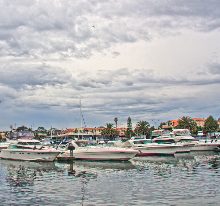
It's my impression that boat marinas are a popular subject for painters -- impressionistic and otherwise -- and I think your photo captures that feeling well.
Post actions
The processing gives this a bit of a look that I have done with some of mine, but I don't find it works well with this particular scene.
Post actions
A tad sharper and that thing in the sky cleaned and I'd give it a 10 for sure. As it is, I still like it and I'll go with a mediocre 7.
Post actions
Has a neat south Florida pastel-ish kinda thing going on. Great sky, cool bird.
Post actions
This sort of seems snap-shottish to me. Coloring is bland, lack of focal subject etc.
Post actions
perhaps a bit too much sky here, and focus appears too soft for these subjects.
Post actions
lol thanks to an ex-bf who repaired these babies for a living, I can guess exactly how much $$$ is floating there on the water! 7
Post actions
looks overprocessed...more contrast or darker would have been better...too light i think...
Post actions
Very, very nice... I'm a pushover for this type of processing! 9
Post actions
Nice effect. Like from the 50's. I like the water surface.
Post actions
Nice processing - the only thing that may be overdone is the amount of sky featured.
Post actions
Composition: 5 - Technical: 4 - Creativity: 4 - Appeal: 5 - Challenge: 5 - Overall Calculated Average Score: 5
Post actions
Post actions
i found this picture a little confusing there seems to be no focus point
Post actions
Post actions
has a nice old postcard look about it...nice







 Add photograph to your favorites
 Add photographer to your favorites

 Photographer found comment helpful.


