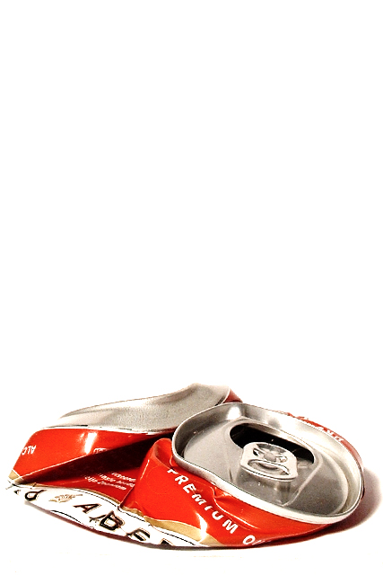
That is some serious negative space. I like the angle and framing/cropping here. The white space really draws my eyes down to look at the crushed can. The lighting on the can is good, I wouldn't want it any brighter though. Focus is good, I think it could be better, but not bad at all. Great shot. Good luck in the challenge. ~Hbunch7187~
A couple of other shots like this in the challenge but I like this one most. Good use of negative space to show where the can "used" to stand tall. 8 - Konador
Well now - this is really great composition, but I thought the page was not displaying properly because all I got was the blank space at the top of my monitor. Good thing I scrolled down to investigate further!
A lot of people would hang this on their wall as a poster with an appropriate caption. Nice use of space. Graet exposure an colour. Expect a high score from me.
One of my pictures of the week - great composition, very well lit, spot-on DOF - can't help wondering how many cans you had to crush in pursuit of the ideal shape...?






 Add photograph to your favorites
 Add photographer to your favorites


