I had to change this from my original entry. I just looked them both over (the final two, there were many more) and felt this was good and a lot less complicated than the other.
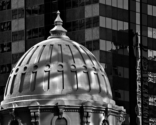
I had it done in color but it really works better in black and white. I have a terrible time with entries and I always seem to choose the wrong one. I hope that I did not choose the wrong one this time.
I have to figure out what I did since I did it at the end of last week...I'll post the post later.
Statistics
Place: 9 out of 115 Avg (all users): 6.2996 Avg (commenters): 7.2727 Avg (participants): 5.8696 Avg (non-participants): 6.4088 Views since voting: 2175 Views during voting: 357 Votes: 227 Comments: 27 Favorites: 3 (view)
Another surprising subject for this challenge (to me; I was stuck on the woodlands concept). Works beautifully, though, and the light makes intersting patterns that complement the architecture.
I really like the clarity of the dome. As a matter of fdact, the contrast of the architecture is really cool against the bulding. Dare I say to bump thgis to a 7? Yes, it is done. 7
Errr. Wow! What amazing shapes. The shadosw on the roof are great, they just add even more to the patterns. Personally I would like to not see the bottom-left corner of the near building/roof cropped out of the frame. Otherwise brilliant!
I find myself wanting to look at the background moreso than the subject which appears flat. I like the b&W but maybe could be better imo with a blurry background.
Razor sharp. B&W was a very good choice as it reveals more detail. I would like to see more of it and less of the background. Maybe centered composition would've been better? I don't know. I like the technical perfection and your eye for the detail.
Great contrast between the light, curved foreground and dark straight background. Nice ro see some architecture in amongst all the dappled forest pics too! Well done.





 Add photograph to your favorites
 Add photographer to your favorites

 Photographer found comment helpful.