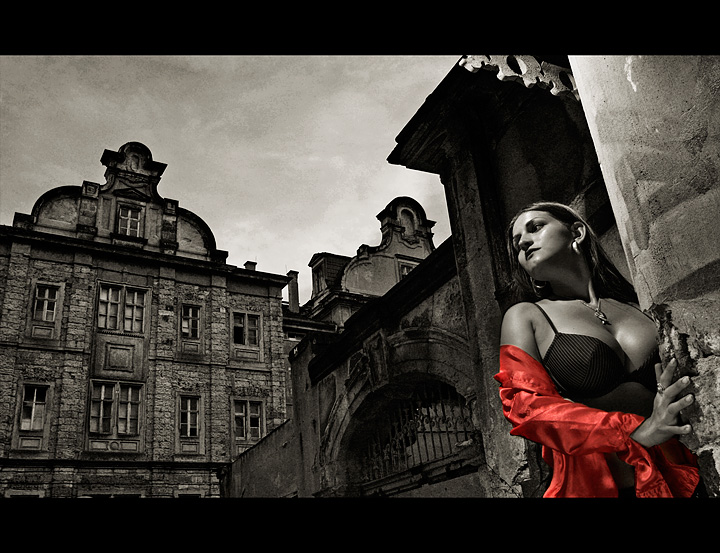
A nice cross between the advanced and the basic version would be good - I say this because she is the star in the basic version and the building almost overpowers her in this one. Not to say this one isn't good - it very much is! I just think she needs to be a touch more prominent.
OK, duh. Just read the rest of the comments. Ignore. :-) It's not the skin tone - I think that works fine in this edit - just the building detail somehow pulls you from her if that makes sense. Oh never mind... it's growing on me...
Your entry is way better. The background may look more dramatic in this one, but the model looks terrible. Combine the two and you've got a real banger.
Christoph - This edit is amazing. Like the earlier comments stated - this edit takes the image to another time, another place, another universe. An instant fave.




 Add photograph to your favorites
 Add photographer to your favorites

 Photographer found comment helpful.


