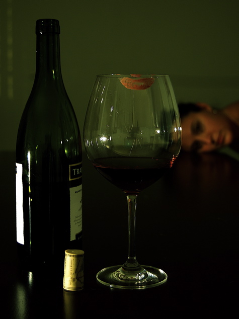
The very first thing that caught my attention was the camera on the tripod reflected in the glass. This along with the line going up make it appear to have a spiderweb crack. This really stands out to me.
Next as I continue looking, the reflections on not only the glass but also the bottle are really unbalanced and add an undesired element. Now this includes not only the light sources but the ambient reflections of the room.
Now with these distraction I am thinking about how to avoid them. However I am not sure exactly what you used for lighting, they appear to be lamps? Ok, with a shutter of 4 they would have to be lamps.
Now, depending what you have available to you, let me first tell you a couple tricks. Though so you know, glass is one of the most difficult subjects to photograph.
You want to place your lights in a position that helps 'hide' the reflection. If you experiment around moving the lights in different positions you will see the placement of the reflection move. You want to put this reflection on a seem or other area that cuts down the possibility of 'flares'.
Next, we want to create 'highlights' on the edges of the glass, because you are allowing the background to be darker we should have lighter highlights. The easiest way to do this would be to use poster board on the sides just outside of camera frame for the glass to mirror off of. In other words, we would see the white poster boards in the glass, but they would appear as long smooth highlights.
Now, with this setup, there are two possible solutions for your camera. One is to move the camera to a different angle to hide its reflection. Which may cause you to lose the perspective you where looking for. Or two, use another poster board with a whole cut in the middle to fit your lense through. This decreases the reflection of everything behind as well. You may have to play with positioning of the poster boards on everything but I think you will be quite pleased with the results.
Looking at the model, I see that slight gap between the model and the table, I am indifferent about it and not sure what I think.
Lastly the bit of reflective line on the upper right corner is a distraction for me. Not sure what that is from except maybe spill from your lights.
Second lastly, I looked at the 'lighter' version and I prefer this one. In the lighter version you lose contrast and the reflections stand out a lot more.
hmm, i am on a dark computer, so i will have to look at this on mine at home, it looks very dark from how i am seeing it now. i will report back with another comment once i can throughly look at your photo:)
Interesting idea. I've never seen the movie, so I'm not sure if that's part of the inspiration. But I like the effect of the girl lying in the background. The wine makes me thirsty! :o)






 Add photograph to your favorites
 Add photographer to your favorites

 Photographer found comment helpful.


