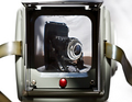
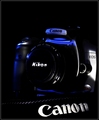
placed camera inside a large-mouthed translucent blue vase on a wooden surface. Added some ribbon for interest. Ambient light. And then shot about 60 or 70 attempts to get it right!
Converted from RAW, cropped. Cloned out some reflections and spots, brought out the blues with Color Balance, Noise Ninja on the background and Smart Sharpen on the camera.
Statistics
Place: 87 out of 137 Avg (all users): 5.3356 Avg (commenters): 7.0000 Avg (participants): 5.0847 Avg (non-participants): 5.5057 Views since voting: 953 Views during voting: 268 Votes: 146 Comments: 10 Favorites: 1 (view)
First off I have to say I enjoy your creativity using the vase. The image really is eye catching at first. I also will admit that when I was voting this challenge I stopped and looked at this image hard.
One of the major things that throws me with this image is the depth of field. With having the ribbon and lense out of focus it distracts my eye. I say eye cause it seems it is heavy on the right side or possibly because that is where the ribbon leaves.
I am wondering now how deep the vase is and if there would have been a way to use a small block to elevate the camera up higher just a bit; it does not appear to be on the ground but I think a bit higher would help. Than have the entire plane the camera is on in focus with the ribbon transitioning from oof to focus to oof underneath.
I think there is a fairly nice control of the ambient lighting here. Though with the dark spot in the middle I think an extra light source or a bounce of light would have added to a stronger focal point.
On the blurred ribbon on the bottom right corner as I see it, next to the camera, it seems there is an odd focal area in how it stops abruptly from being ultra smooth to textured. Not sure if this was done in post, or natural oddity or other but it creates a hard line which may be for the added distraction.
I believe the biggest faults here is the shallow dof and the dark center. Other than that I enjoy the colours and simplistic creativity.
What does this for me is the use of color. So many folks went with b&w or silver/gray. There is a simplicity in the elegance of the color. I wonder what this looks like tilted 180 degrees...right now the camera is upside down. Could be distracting, yet perhaps this angle is correct...wish I could turn my monitor on it's head to figure it out.
I love the creativity and color of this. The image quality seems a bit off -- noise?, focus?, DOF? Also I like it a bit better with some of the top cropped off (squared).






 Add photograph to your favorites
 Add photographer to your favorites

 Photographer found comment helpful.


