I agree with everything MaryO said. I probably would've given it a 6. From me, that means it's a good image, but it doesn't grab me in a big way. It's pretty, but not spectacular. To me.
Looking at this result you've got a respectable final score, pretty normal distribution of votes in the ever-popular Bell curve pattern, and some nice comments telling you what people like and what they don't. There are always low votes, even on the best entries, and about a billion threads from people trying to understand them. My advice is to not bother trying to understand ;-)
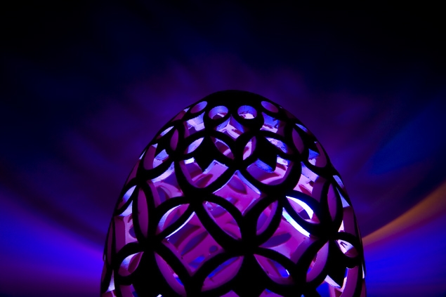
And while I didn't vote on this one, I would have given it a 7 or so. Great color, interesting patterns and a creative approach that made dappled light instead of finding a subject affected by natural dappled light. Were it my image I would hue-shift the orange to blue/purple and center the object; it is almost centered now which always invites people to notice it's slightly off, and the orange interrupts the otherwise fairly symmetrical look of the background.
I have no idea what this is and whether I am viewing artificial dappling or the real thing. Never the less, I kept me interested for a few moments. Bon - chance!
God knows what is it, but it works. Probably there is something happening below the picture, which you didn't want to show, but it screams to show the full shape. Lovely colours. It looks a bit soft, but may be my LCD as well.
I'm not sure what this is, but it's very pretty! Could do with being fully central, or more off set - to me it just looks a bit misaligned and a little wonky.





 Add photograph to your favorites
 Add photographer to your favorites

 Photographer found comment helpful.


