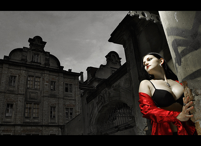
when i read the challenge title and despription the first thing that came to my mind really was sin city, because i totally dig the lighting and angles in that movie and always wanted to try to duplicate that style. i also immediately had the location in my mind as of Pirna Sonnenstein, which is an old abandoned castle overlooking an old town. i posted a similar angled shot in the b&w-a-week side challenge:
this old castle really is a place of sins, since during WWII the nazi's killed about 15000 mentally handicaped people in the course of the "euthanasia plan #4" in the basements of the castle.
the photo itself can be seen as pretty sinful because of the seductive young lady and the abandoned castle represents "city", hence "sin city", so i hope it kinda meets the challenge for both matching the title as well as the content and style of the movie itself ;)
i sure wish this challenge was advanced editing, because when we took this it was like 8pm and very dark already, so the background seems really dark and kinda flat.
here's an advanced edited version:
i lit this with two external old manual flashes one from above her head and one for fill with an umbrella from the left. i'm not totally happy with the lighting but i think it comes close to what the movie looked like so you get the idea.
and again thanks to my lovely model Linda for making this possible and for not getting distracted by all the people giving us strange looks as they were passing by ;-D
----------------------
post challenge:
thanks so much for the ribbon and lovely comments everyone, i'm so honoured!
i just sent my update button on holiday to the fiji islands cus i thought it needed a break after this crazy week...:D
Statistics
Place: 2 out of 246 Avg (all users): 7.1737 Avg (commenters): 8.6875 Avg (participants): 7.2394 Avg (non-participants): 7.1345 Views since voting: 13382 Views during voting: 432 Votes: 190 Comments: 63 Favorites: 23 (view)
well, i did'nt know i requested a critique but thanks anyways! ;)
yeah the bird boo bothers me, but since this was under basic editing rules i could hardly do anything against it.
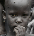
actually it's interesting what you mention about the african child portrait. if you look at the ribbon winners in this challenge you will notice they're so different from each other in appearance, post processing and content and i think that's what makes this site and the challenges so interesting. everything's possible. and btw i think "i dreamed of africa" really deserves to be in first spot, like i said it's the most powerful and provoking image i've seen here for a long time. so cudos to the voters who, to my surprise, agreed with me to chose this not-so-dpc-friendly image for the blue!
again thanks for the kind words everyone, i really appriciate it! :)
*Critique Club*
Hi, my name is Russell and I am doing the critique that you requested!!
First off, let me say, this is REALLY a tough one!! Not only did you ribbon, I thought (personally) that it should have been first place.
What I liked - The idea and title is truly "nailed" (I too, am a big fan of the movie), so the composition is great. Your background is a perfect fit. Overall, it not only matches the challenge but exceeds it (again GREAT call on the movie)
What I didn't like - Now is where the critique gets tough - it is such a great shot, that anything mentioned here are strictly personal thoughts, so please take it for what it is worth.
The lighting above and to the right of the model lightens that section of wall making it a part of her vs a part of the setting.
The bird "pooh" could have been taken out or darkened a bit.
Overall, there is VERY little NOT to like here, the likely reason you came in second instead of first was due to the African child portrait, not overly creative, but very powerful in it's vision - I see alot of ribbons coming your way in the future!!
One of the most sensual shots I've seen on DPC for a while. The tonal quality is exquisite, thanks to the S3 Pro, and the composition is top notch. Had I voted, I'd given you a 9 or even stretched to where I never go ..... a 10.
I prefer the 'streetlight' look of the one you entered a lot more than the advanced edited one. She really jumps off the image in it.
Congrats on the ribbon, its well deserving!
Ya know what, I think I like the basic edit better that the advanced. The tone of her skin contrasts nicely with the background. Congratulations on a well deserved ribbon!
Wow, that's great! I actually like your basic version better than the advanced. Lovely light on your model; the rest is "context" anyway, and being flat light emphasizes the model. Super! Congratulations! A new fav for me.
Hey
This is cool! Congrats on the ribbon. Many more coming your way. No doubt.You're right the advance edit is sweeeet! I am going to have to get some pinters on the editing.
Christoph!!! Congratulations.. its always so exciting seeing someone you know walk away with a ribbon for their hard work and dedication.. Its a lovely image..quite powerful in all respects.
;) so are you and your talent coming to the workshop this year?? Calgary is lovely in the summer!! *nudge*
OUTSTANDING!!! Huge congrats on this - the score, the placement, the average from the commenters - but mostly for shooting what you shoot so well, making it work for this challenge, and getting some long-deserved recognition. Great to see your work on the front page!
Beautiful Chris! Congratulations on your first ribbon! Great idea, I love the lighting and the setting and the model, and actually like your submission way more than your edited version, the contrast between dark background and model is great.
You did a great job here, Christoph. What a stunning shot and so perfect for the challenge. Huge congrats on your first ribbon (the first of many, I hope).
congrats on your first ribbon, this certainly catches the cinematography of the movie, very strong image and you have an awesome portfolio too, added to faves :)
Very good lighting, love the colour and the pose. actually my favourite photo in this challenge, hope you get the a ribbon, would be well deserved. good luck!
I was wandering if someone will take a chance with Sin City. Your model is not only beautiful but also brave. I hope it's legal in basic, because I'm rating it high. I like the splash of colour. You captured the mood of the movie perfectly.
Gorgeous use of light and color, terrific model and location, excellent composition. The title works, and as a bonus the photo echoes the selective color process of the film itself. A high score from me.





 Sin City
 Add photograph to your favorites
 Add photographer to your favorites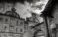


 Photographer found comment helpful.


