Author Thread
Post actions
Originally posted by ScooterMcNutty:
not workin' for me...
Post actions
Comments Made During the Challenge
Post actions
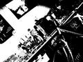
The contrast is way too hot, and the focus is off.
Post actions
Oversaturated and not very well composed
Post actions
Post actions
Interesting High-key processing, though it seems a bit blurred and lacking detail overall.
Post actions
I like the blue sweater, but the other colors seem dual.
Post actions
Too contrasted its a bit hard to look at.
Post actions
Good shot i like the colors alot
Post actions
Not a very good picture here, lots of blown highlights, not a good angle, just not very interesting
Post actions
Nice coloring and very pretty scene, however the black spot on the lower right side of the shot is somewhat distracting. If that was cropped out it would make it less of a bullseye shot and eliminate the spot too.
Post actions
Post actions
Oversaturated, I think you were going for that, but it is a bit too much form me. Bringing out the blue levels would've made this really cool.







 Add photograph to your favorites
 Add photographer to your favorites


 Photographer found comment helpful.


