Author Thread Comments Made During the Challenge
Post actions
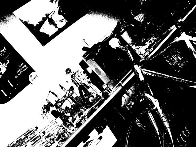
This picture is very high contrast. It is very hard to find the bicycle. Also the angle is more disorienting than artistic.
Post actions
Post actions
But it isn't Specialized... Nice high contrast.
Post actions
Post actions
dont know what it is but looking good 9
Post actions
My first good bike was a Trek 520. Does Trek make any steel frames anymore?
Post actions
Not keen on the back and white. Is that a threshold adjustment layer?
Post actions
I can barely make out where the bike is... a little contrast crazy huh?
Post actions
I love the high contrast and the grittiness of this. Also, I like that it is tilted -- adds even more "dynamics" to it.
Post actions
the tilt is too distracting.
Post actions
im a huge fan of high contrast images so on that front, nicely done. but it might be a little too intense as all of the white makes it difficult to make out just what's what
Post actions
to much contrast. the bike is very hard to see
Post actions
I like the concept, but too busy for the technique. Looks kinda cool though.
Post actions
I like the idea - - but the sharp contrast makes it hard to see where the bike is in relation to the background - - I can't really tell what I'm looking at.
Post actions
Post actions
OK, definitely would take some getting used to. Problem is that I can't interpret easily what this image is conveying. 4





 Add photograph to your favorites
 Add photographer to your favorites


