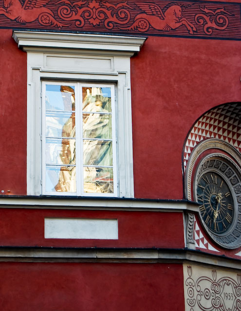
My eyes are drawn to three separate elements of your photo: The window with the reflection, the clock on the right and then the winged horse. For me, the three items don't seem to go together, but I like the color of the building.
Composition: 4 - To me, you cropped out (or left out) the more interesting part of the image
Technical: 5
Creativity: 6 - A point for seeing the unseen :)
Appeal: 3 - Just doesn't do it for me.
Challenge: 6 - Good tie in to the image.
Overall Calculated Average Score: 5
I think that there is too much to look at. I am not sure what the subject is. Going by the title I presume that it is the window. Then I would crop out most of the right.





 Add photograph to your favorites
 Add photographer to your favorites


 Photographer found comment helpful.


