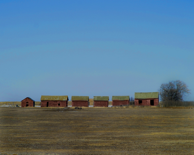
Everything seems a bit too...centered for me. I think this would have had more of an impact for me if you zoomed out and left more negative space on the right or left of the barns
The colours in the image are very complementary. The size of the buildings relative to the overall image give some impact. More may be achieved by cropping out some of the foreground.
There appears to be some colour banding in the sky. This may just be related to the downsizing to meet the file size requirements. (Viewed with 32 bit colour and 1280x1024 resolution)
The first note is that I see some banding in the sky - and i've checked and don't see it on similarly graded tonal images, so i think it must be in your picture.
Like the idea though - there's a bleakness, an isolation and desolation about it. Not completely convinced about the execution though - and i think that is down to the moment of light you've chosen - or perhaps even the point of view. Did you try getting right down to the ground, so that the barns formed more of a horizon, or at least less horizon was visible beyond them? They somehow don't seem to impose themselves enough on this image, and I think that might have helped.







 Add photograph to your favorites
 Add photographer to your favorites


 Photographer found comment helpful.


