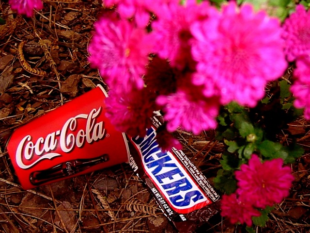
I think the pohot would be better if both the flower and trash were is focus, or if the flowers were in focus, and the trash in the background was "ruining" your flower shot. That's the first thing that pops into my head when I see this shot, the garbage ruining a shot, which would be perfect for the challenge.
Composition: Subject Placement, Cropping, Background7, Technical: Focus, Exposure, Lighting, Processing7, Appeal: Is it Interesting, Motivating, Etc.? 5, Total Averaged Rating6. Autool I think that if the dof was increased just enough to bring the flowers a little more in focus it would be a lot better. They are disturbing being out of focus and in the foreground at the same time. Just my opinion.
What do you mean ?????????????????????????????????????????????????????????????????????????????????????????????????????????????????????????????????????????????????????????????????????????????????????????????????????????????????????????????????????????????????????????????
I like your concept, but: the "Beauty" is not in focus, there are two "Beasts" and the image is too explicit, as if the Beast was Coke ans Snikers, not garvage.
THe pink flowers are so out of focus they are really distracting from the garbage here. The garbage is in great focus though. Lighting on the garbage is great, but the flower (that appears) closest to the camera is kind of too bright, or has some kind of strange glare on it. The angle and framing/cropping you have chosen is nice. Overall a nice idea, but I think it is brought down by the oof flowers. Good luck in the challenge. ~Hbunch7187~
i bet you've got one just like this only with the focus on the flower instead of the trash. bet the coke and snickers would've lent meaning even if they were a little blurry, would've made it an 8 instead of a 7. nice job though, like the composition.
This is a neat concept and I applaud you for submitting it :) My only real gripe on the photo is the lack of focus on the flowers. It's... distracting to me. A different colored flower may have worked a little better, maybe yellow? I don't feel that it really contrasts enough with the red on the coke cup - 6 - JB
Gross. the red and teh pink clash. how could you even think of taking such a picture. i bet you had some one like your wife telling you it was okay, didn't you. :-) karmat
blown out flowers--trash good detail--i like the color--wish the flowers were out of the image the left side of the brown leaves would work well with the whole background---7bobgaither




 Add photograph to your favorites
 Add photographer to your favorites


 Photographer found comment helpful.


