Author Thread
Post actions
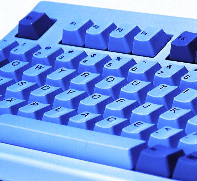
i think this was a great idea ... and it is totally obvious what is 'out of place'
Post actions
Comments Made During the Challenge
Post actions
Post actions
Post actions
2 'O's???
Post actions
Too cutesy for my taste...
Post actions
Cute! Good luck in the challenge. (i hope you were able to put your keyboard back together o.k. - that would drive me crazy!)
Post actions
Very good. Very creative.
Post actions
And how are the illiterates supposed to judge this one? I find the blue tone offputting and the focus a bit loose.
Post actions
Good idea, and I like the depth of field choice, but why is the keyboard blue? If it's a filter, why? If it's an actual blue keyboard, where do I get one?
Post actions
Good job you are the best i've seen yet. I like the way you think. That was very creative. I love this so much. Real cute...LOL!
Post actions
It took a minute, but I got it. CUTE!
Post actions
Post actions
HAHAHA thats neat, but hard to see
Post actions
Post actions
I only noticed on the second look what this spells... Nice idea, but I'm afraid it takes to long to notice.
Post actions
I would have preferred more natural colors, instead of a blue tint, for this photo.
Post actions
Now this is very original, and not too bad on the photographic side of it as well...good job...
Post actions
Typed on your keyboard:
Post actions
Post actions
Great, subtle humor! fantastic!
Post actions
Post actions
Nice Idea - The colouration adds to the effect
Post actions
Took me a while to see the "out of place"... Because of the title, I looked at the top letters and expected them to be "querky", but then looked and couldn't figure out what was going on. An excellent shot, to be sure, but hopefully people will bother to look for more than 3 seconds before they vote and figure out what's really going on here.
Post actions
Wow, that must have taken a while! A border would be nice on this one.
Post actions
I like it, but I think the extreme blue tint is somewhat distracting






 Add photograph to your favorites
 Add photographer to your favorites


 Photographer found comment helpful.


