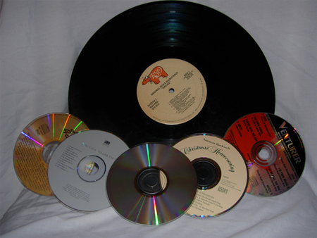
Good idea, nicely laid out. I think it would have been better to move them away from the background, then you could have used shalllow DOF. And try to make the base of the backdrop also "disappear" out of the forefront of attention.
The idea is good and meets the challenge. Firstly, the image seems a little small, remember you can go 640 pixels on the longest side, which can help with the details in the image. The wrinkles in the fabric and the fact that it is so close to the other elements makes the background become an element in the shot. A way to avoid that is to make sure the foreground elements are not leaning against or too close to the background. The image also looks underexposed, which an adjustment with levels or curves in an editing program could have helped with.






 Add photograph to your favorites
 Add photographer to your favorites


 Photographer found comment helpful.


