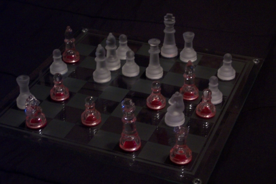
1. Too dark 2. Too obsecure 3. The reflection of the pure glass pieces is distracting. Basically your shot, though not original, is a nice idea, just not executed well. 3
Image seems too dark and a little out of focus. Given the position that poor king is beyond chaos, he is dead! Serves black right for loosing his queen.
This one's a little dark on my monitor, so much so that it's a bit hard to see the chess squares. It could have looked even more chaotic, if a piece or two had been knocked over, or some of them weren't in their squares. Good attempt though at capturing the challenge







 Add photograph to your favorites
 Add photographer to your favorites


 Photographer found comment helpful.
