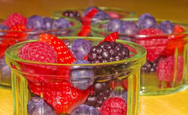
Hi, I think that this is a good idea but with a very bad realization. The most important problem that I see (always as my personal opinion) is the light. too much on the fruits and too much strong. the colours aren't very good, not natural but this is a consequence of the light.
from compositional point of view is good.
Gennaro
P.S. if you have something to ask me please send me a personal message.
seems a bit overexposed to me. No doubt it's healthy though. Also seems like the berries are obscured too much by the dishes. I like the shallow dof and the dishes in the background. Would also like to have seen them arranged in a row diagonally.
I like the subject/food choice overall. The yellow tint of the bg is killing this for me. The clear dishes with a white (heck, I'd even try black just to see) bg might be more appealing. All JMO of course. :-) Good luck in the challenge.





 Add photograph to your favorites
 Add photographer to your favorites

 Photographer found comment helpful.


