Author Thread Comments Made During the Challenge
Post actions
too red for me, with not enough contrast, but i do like the pattern
Post actions
Post actions
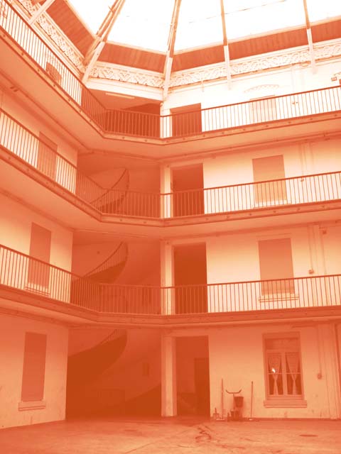
A little too orange. I think I'd like it with a little more definition in the shadows and highlights.
Post actions
For me this looks too washed-out and I'm sorry but I don't find it very interesting
Post actions
It's a little too orange, and needs more contrast. The darkest tones aren't dark enough and that gives is a foggy feeling.
Post actions
Perhaps a bit too redish and misty? I like the stair case that runs through very much though.
Post actions
Too washed out and too much sepia.
Post actions
Post actions
This isnt really sepia... DNMC. Plus you need more contrast.
Post actions
Lacks contrast and any real focal point.
Post actions
well what can you say it is orange, OOF and blurry,
Post actions
Seems too overexposed and orange.
Post actions
I don't see this as Sepia, it is really more of an orange. The building has some nice angles, but the shot is lacking detail.
Post actions
Much too orange for sepia. Sepia tone refers to the coloring of a black and white photographic print that has been toned with a sepia toner to simulate the faded brownish color of some early photographs.






 Add photograph to your favorites
 Add photographer to your favorites


