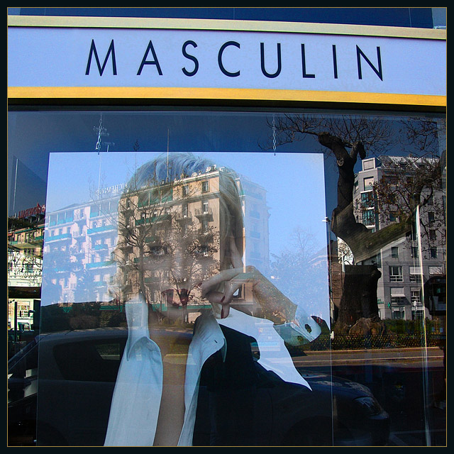
onimages such as this i like to see the text flush or square with the edge of the photo. shooting straight on i think makes a more bold statement when it comes to "propaganda-ish" imagery like this. as far as being "out of place", it seems that the store was trying to create this juxtaposition. and in that respect, i lose some interest in the shot. its a bit too obvious.
Nice composition, but the reflections on the window are just as strong as the picture in the window that is your subject. hurts you for the challenge, but makes for an intersedting shot.







 Add photograph to your favorites
 Add photographer to your favorites

 Photographer found comment helpful.


