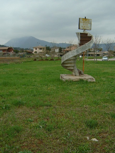
A concrete staircase advertising a staircase company (who would buy from them???) that stands in a field near a shopping centre near Lake Garda. It has been there at least 10 years and is something that has always struck me as odd.
Statistics
Place: 57 out of 241 Avg (all users): 5.6703 Avg (commenters): 5.5789 Avg (participants): 5.6538 Avg (non-participants): 5.6802 Views since voting: 1357 Votes: 276 Comments: 20 Favorites: 0
Thats a great entry...I would have maybe chopped off some of the green grass in the front, it really does not add anything....but a perfect submission to the contest..nice job.
a tighter crop off the bottom, the absence of the little white car and a wider aperture/ faster shutter speed would have made this picture so much better. your subject is really awesome though and the overall composition is powerful. just typical dpc nit-picking. i would like to play around with this picture in PS to subtract the car, crop tighter at the bottom and adjust levels and shadow/highlights to give it more pizzaz. only by your permission though. good luck!!! 6
too much empty space in the lower part of the shot... way too much!
and what's the title and the subject got to do with "out of place"?
also not enough light...
Very good idea here and fits the challenge very well. There is something about this picture that makes me not like it as much as I could. I think it is good that you have a wide filed of view so you can really see that this staircase is in the middle of a filed and indeed going nowhere but I think all the grass in the foreground is a little distracting. Maybe if this had been taken in the late evening or early morning it would have been better. I think it is the lighting that is hurting it for me.
Since the stairway is what you are shooting, make it fill more of the frame. The houses the little trees, the parked car do nothing to help this shot. Get in tighter!
....heven? Litle underexposed. Maybe lite more croping from right to exclude the car. You have a strange and photogenic bacground there but maybe it would have been better to give it litle swallower DOF to blurr it a bit. But this is a strange and good image.





 Add photograph to your favorites
 Add photographer to your favorites


