Challenge:Out of Place (Basic Editing I) Camera:Sony DSC-F717 Location: Living room floor, Olching, Germany Date: Mar 29, 2004 Aperture: 2.1 ISO: 100 Shutter: 1/3 Galleries:Abstract, Studio Date Uploaded: Mar 30, 2004
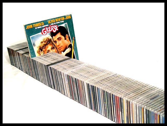
This image seems to meet the challenge well and it received a good average score in the end. Critique on this one is a bit difficult. I can't say that I would change anything about it. It appears that you achieved your objective. There is nothing that could be added or removed that would make a significant change in the presentation.
Now, from a personal standpoint...
What WAS your objective with this photo? Is it a design for the sole purpose of the challenge? What does the image say to you? What does it say about you? Is there emotional value here? Is music a part of your personality?
Nice idea and a good setup. Maybe you should have given it a more croping or somehow let the CD-stack through the whole frame. Did you try another angel, f. instance from a lower angel and use shallower DOF, keeping the vinyl and closebye CD´s in focus but blurring out other CD´s. Just an idea. Fine image.
Very clean and classy look - well done. The overall style matches the style of that album cover really well, although this style probably won't appeal to everybody.
This would have been a 9 or a ten witht the exception of three things. First and most obvious to me---the yellow stain and awkward shadow in the middle left near the end of the cd's. Secondly, i think that the diagonal of the CD's should have been a diagonal of the rectangular frame. Lastly, it would have been more effective (even without the diagonals alligned) if the cd's went all the way across.







 Add photograph to your favorites
 Add photographer to your favorites

 Photographer found comment helpful.


