Well executed, Great lighting. You might get several extra hits on this shot....Lol. I use it to make sure my monitor brightness hasn't changed...Lol...Nicely done....ace
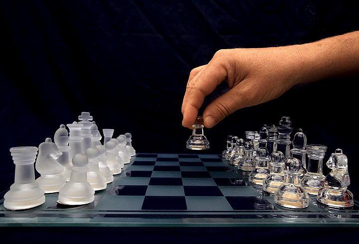
If I look at my monitor from a high POV (looking down on the monitor) I can clearly see a backdrop with diagonal wrinkles and a horizontal fold line about 50 pixels above the index knuckle on the hand. Look at the monitor as one should eye level and at no horizontal angle, I can faintly see what the background. Looking from a slightly low POV the background appears to be clean.
These factors make me wonder. Is their anything you could of done to make the background (as-is) blend in so it would not show any wrinkles or folds. Do people when the vote look at the photographs at eye-level and perpendicular to their screens (as they should) or do people vote leaned over, propping their head on one hand. Is their monitor to high or low? how does voting while looking at a monitor at an odd angle effect the score of a photograph. I can't help but feel that several of the 59 voters that rated it a 6 would have possibly rated your shot as a 7 if they viewed the photograph correctly. Something to think about. But we can't control everything.
Yep, there there if I scrunch my eyes and look from the far right with my tongue in my left cheek but from straight on I do not see it, mines calibrated also.
I am looking at it on a wide gamut display (Dell 2408 HC) calibrated to Adobe 1998 CG with Spyder 3 Elite and looks great on here.
Just checked on my other monitor which is a pretty bog standard display (calibrated) and I can `just` make out something going on in the background.. I think people need to check their brightness/contrast settings.
Like the light on the board and translucent pieces, especially.
Not a game I play often, but how come the clear Rook isn't in the corner? And the Knight who is in that spot appears to be bleeding internally (yikes!)?
Great chess set, and so is the picture. I also like the contrast between the cool set and the warm hand. My only nitpicking is outside photography (and that it is the white who should make the first move...)
Nicely composed. I like the use of symmetry. It works well in this image. I am a bit confused as to why the front frosted pawn is (or at least appears to be) leaning forward. Perhaps a lens effect?
Oh, by the way, the knight and the rook of the clear pieces.... well... uhm.... I think you know.
I really like this shot, next time be sure to rotate the pawn on the left side so the felt on the bottom is hidden and not distracting from the "clean" look of the pieces.
Nice image with good composition. I find the hand color rather distracting and think this would have been a good shot for B&W, but maybe that's just me.
Nicely set up, though your backdrop may hurt the score a bit. If you had it further back so the folds were blurred it would enhance this shot more. Nice chess set,too.
At least 2 of this particular chess set in this challenge. I'm glad I didn't use my identical one that I used in 2 previous challenges. Nice perspective and deep DOF.





 Add photograph to your favorites
 Add photographer to your favorites

 Photographer found comment helpful.


