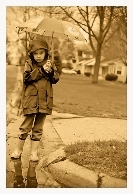
good focus and clarity; I think sepia doesn't fit here too well, this would work better with a blueish tint or in muted color (I understand this couldn't have been entered here)
This really caught my eye, I like it a lot. The lighting and everything is really nice. I think the only thing that could have made it a little better would be if it were sprinkling on her.
I like the shot and I love the angle it was taken. I don't think that Sepia complements this image though. I think this would be much better served as greyscale or heavily desaturated.
Nice work. Too bad you cannot add an overlay in basic editing as I think an overlay to look like paper crackles across it would really make this look like an old faded b/w sepia
i like the clarity of the girl but wish the background was a bit more out of focus, if i have the terminology right, more DOF would be good or a bit less to distract in the background, 5







 Add photograph to your favorites
 Add photographer to your favorites

 Photographer found comment helpful.


