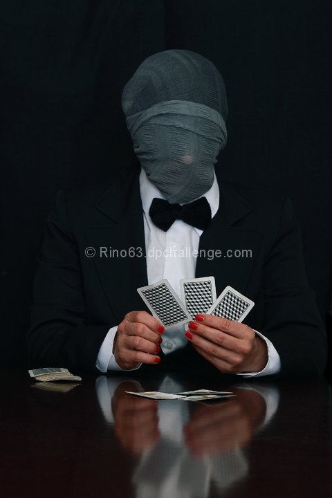
Compositionally, this is a fairly strong picture. It does seem a bit static, though, because it is straight on. Sometimes, a touch of tilt (enough to look like it was done purposefully) can add interest and drama to the story.
Technically, the lighting, exposure, focus and color are superb. It might have added more action to the shot if the shutter was slowed and the person was tossing a card toward the camera. That may not have been your intent, though.
I've read your notes, and it still isn't clear to me why the player is neither male or female (though the red finger nails makes me think female).
Good shot, but your artistic vision/purpose may have been overlooked by the voters.
Fantastique! I didn't vote in this challenge, but this would have got a high score from me -- even though the suit and shirt are too big for the model. ;-)
Odd with the hands not matching the clothes, but I don't like the way the face is hidden. Maybe you could have hidden the face with the cards and a different angle.







 Add photograph to your favorites
 Add photographer to your favorites

 Photographer found comment helpful.


