Author Thread
Post actions
I really liked this one, great shot. love the angle, the colors, everything, great job :D
Comments Made During the Challenge
Post actions
A very good shot!
Post actions
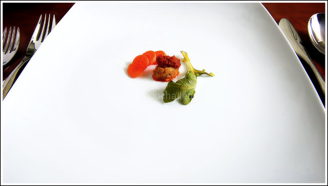
Nice and clean. No distractions. I like it a lot. Just a little more light on the table, above the forks to make it more like the other side would of been nice.9 from me
Post actions
Portion control does work health-wise for some.
Post actions
I've been to restaurants with serving sizes about this size. Funny.
Post actions
Utensils seem to be in perfect focus but the food seems slightly OOf, meets challenge nicely though
Post actions
I floss things bigger then that. :)
Post actions
Not voting just commenting. I like the minimalist approach, but the glimpses of the utensils are actually so interesting they disrupt the main presentation.
Post actions
Post actions
Ha, I've been to restaurants that serve serving like this! Neat photo though!
Post actions
Is this supposed to be a joke on expensive food? Nice use of perspective
Post actions
Yeah it's healthy, but it doesn't really look that delicious. I think the only way this would appear in a magazine is as a joke. Photowise i would say this has a nice balance to it and a great use of color to add emphasis. the silverware, with their hotspots, is a bit distracting and out of place.
Post actions
Post actions
Post actions
Post actions
I feel there is just too much white expanse here!
Post actions
YEP- this I could definatly see in a magazine ! (I think i -have- seen something like this *LOL*) nicely done-- very high score! :) love the shapes ;) and simplicity :)
Post actions
how you left the silverware just a little visible was a really good choice. it helps make the plate look even larger then how it already is
Post actions
Not healthy to eat that little! However interesting compo.
Post actions
Very minimalist. I can dig it.
Post actions
lol, very good, an extra point for making me laugh
Post actions
would work much better with a less centered composition. reds are oversaturated, there's no more texture visible in the carrot slices
Post actions
An interesting perspective and great light - 10
Post actions
LOL...that's funny! That will cost you $40 in some restaurants
Post actions





 Add photograph to your favorites
 Add photographer to your favorites


 Photographer found comment helpful.


