Author Thread Comments Made During the Challenge
Post actions
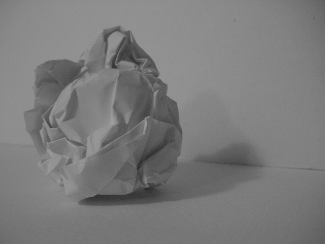
A little too gray. A white-on-white may have worked better.
Post actions
A little dark for a photo that appears to be mostly white. Try some contrast.
Post actions
Not sure why the black and white here. It kind of makes the photo look a little darker than it should. Your angle is nice and I like the framing/cropping. Focus seems ok. Overall an average shot. Good luck in the challenge. ~hbunch7187~
Post actions
Composition: Subject Placement, Cropping, Background7,
Post actions
Nie try. Poor lighting. Nice framing. uninteresting subject. 4/10 for the effort.
Post actions
Little more light would help bring out the shadows. Good composition (6) MarkRob
Post actions
At first I thought it needed more contrast, but the faded grey look grew on me quickly. 9
Post actions
The concept and composition on this photo are both good... The lighting is a bit weak, however. - setzler
Post actions
Post actions
simple and good, seven for you.
Post actions
might look better with more contrast?
Post actions
It might have been better to have a darker background. It all blends in too much IMO.
Post actions
This photo doesn't show much of anything interisting. It's a bit on the dark side as well...sorry :( 3
Post actions
Under-exposed. Needs levels adjusted. (5)
Post actions
Good idea, but would be better if it was more "white". A bit dark for my taste.
Post actions
contrast isn't quite upto scratch.. image doesn't really grab me.. 4
Post actions
I think this shot could have been very effective with a little more light. Then there would have been good contrast between the white and the shadow. But everything just sort of looks gray as it is.
Post actions
Technically correct , exposure, focus, saturation , contrast. 5 very soft sorry if that is intentional
Post actions
Post actions
I really like this simple concept, but it needs to be brighter, so it actually is white... it's too dull this way.






 Add photograph to your favorites
 Add photographer to your favorites


