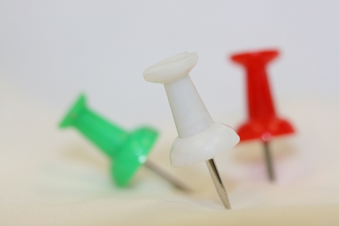
I was trying this for the macro but was not sure if I liked it. i thought it might fit better in the "odd" challenge as it is an odd shot. I am trying to get my creative juices flowing once again and with my new macro lense I am just learning how to use it.
Statistics
Place: 143 out of 169 Avg (all users): 4.6813 Avg (commenters): 5.0000 Avg (participants): 4.5800 Avg (non-participants): 4.7273 Views since voting: 1186 Views during voting: 214 Votes: 160 Comments: 5 Favorites: 1 (view)
This is a cool idea! I like the fact that the white one is the most in focus while the green and the red OOF. The fact that all three are different colors which makes them each odd to each other.
The only real "negatives" that I can see about the photo is just stuff that I have had said about some of my photos. Early on photos of mine, like this one, got comments about being a small jpeg, and that I should use the entire 640 pixels on the longest side for the best effect/presentation. (Those comments helped me to know that I really didn't know that the "Save for Web" function on the File tab in Photo Shop would help to save the size as well as the quality of my photo.)
Now, I am consistently accurate with size, but I still have issues (not "issues", like I disagree because even I can that they are "too soft," but issues with how to consistently make them look sharp) with the comments about my soft focus problems which is probably THE most grievous aspect of digital photography for me. "Film" has always been kind to me in the sharpness department, but "Digital" is at best "not user-friendly."
If it comforts you at all, last week I had two or three solid "5s", but now I have two low "4s".
Bottom Line: You have the creative concept of photography...Simplicity! The technicals come with experience...because even MY photos have improved consistently (though that improvement has been insanely slow.)
I once heard these words of wisdom. "Wisdom is demonstrated by good choices. Good choices are the results of experience. Experience is the consequence of bad choices." To THAT I can personally testify! :)
It does need some work, but I also think it shows a very good effort to try and make an interesting composition of common objects. Some white balance changes and playing with the lighting could vastly improve it.
Odd one out is unfocused. Odd one out is white compared to the coloured ones. Odd one out is in the foreground. Yes, that yellow tint is not appealing but this photo fits the challenge. I don't agree with your description of this being an odd shot though.
Yes, but which one is the odd one out? You've done a nice job technically, but the message is confused. Personally i'd have liked one of the pins to be more obviously different.
a good concept for this challenge and generally i think it was pretty well delivered compositionally, with good control of DOF, but I think that the image suffers from being a bit underexposed and a yellow tint in the lower right





 Add photograph to your favorites
 Add photographer to your favorites


 Photographer found comment helpful.


