Author Thread Comments Made During the Challenge
Post actions
Post actions
Post actions
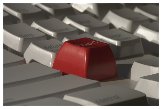
Good angel and technically well done though it probably would have tolerated lite more colorsaturation and contrast.
Post actions
hahahaha...thanks for the laugh.
Post actions
Having the main subject in the middle is usually a no-no but here it seems to work.
Post actions
If only I had a "panic" button on my computer! Nice picture.
Post actions
Post actions
A better perspective and lighting would have helped a lot. Hard to read 'Panic'
Post actions
nice as colours.... but i don't find it out of place
Post actions
I have a keyboard like that. well framed . I think the light might be smoother as those shadows on the numerical keys are distracting.
Post actions
I need to get one of those buttons. Nicely done. I might have cropped the panic button more to the left so it wouldn't be so centered, but it is still good.
Post actions
IMHO, it would have worked better without so much gray and shadow--make the keys whiter to bring out contrast. Whiter keys would make the red one even more stunning. Good picture over all.
Post actions
ORIGINAL...VERY original!!!







 Add photograph to your favorites
 Add photographer to your favorites


 Photographer found comment helpful.


