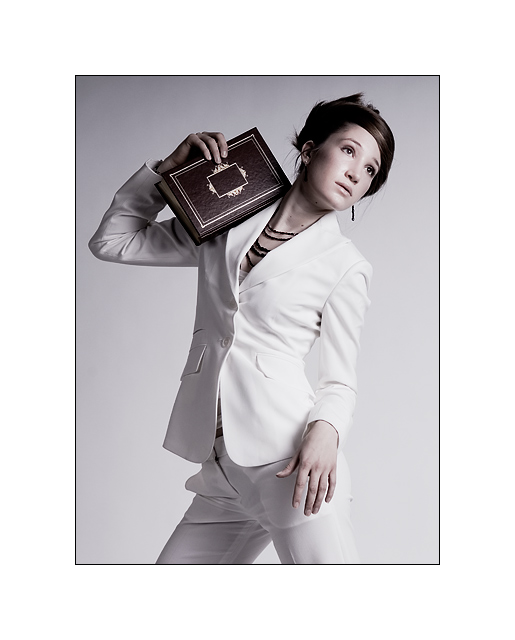
beautiful portrait... nicely lit! However I do not get the huge white frame... I really think it detracts from this image (although it pushes it slightly more into the challenge topic.) but the photo should convey odd and not the frame.
I'm trying to figure out what makes this odd. Nice composition and pretty good lighting, but the posture of the model is a bit strained. The border is too big.
Looks like it would fit right in a fashion magazine. Only part I'm not sure about is the grey area at the top on the background, but that is minor. Everything else looks very professional. I really like her pose. I'm not sure what happened to her other finger holding the book, but it doesn't bother me too much.
it's a wonderful, professional image...not seeing anything odd about it....but great shot...perfect shot actually, not sure about this for the challenge 8
this is a nice photo, but what is odd about it? nothing I can honestly see.
If you were going for the whole "there is one model and one book, so it's odd" thing. Well it doesn't work. You can only do that if your model somehow tells the audience that she's alone, that she's the odd one out sort of thing, and same idea with the book.
Again I think it's a great image, just not for this challenge





 Add photograph to your favorites
 Add photographer to your favorites


