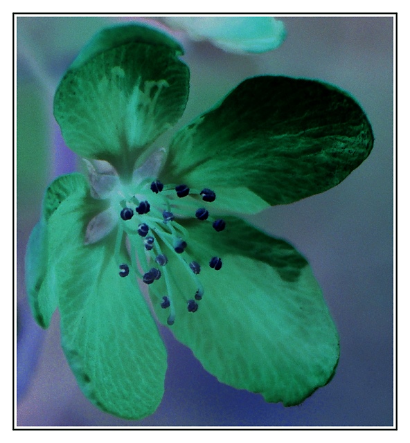
Well, another challenge where I learned something. Some lovely images look hideous when you invert them! I played with a bunch of different floral subjects and a few almost B&W ones, and didn't care for the results on a lot. One thing I found helped was to decrease the contrast before inverting the colors, and then increasing the contrast on the resulting inverted image. It helped avoid some of the blown out looks I was getting otherwise. Really interesting process. Had a couple of crabapple shots to choose from but decided to crop down to a simple one.
Anyway, this one is kind of fun and nice to look at IMO, so I'll give it a shot. It's that or suffer without an update button for DAYS!!








 Add photograph to your favorites
 Add photographer to your favorites


 Photographer found comment helpful.