Hello from the Critique Club,
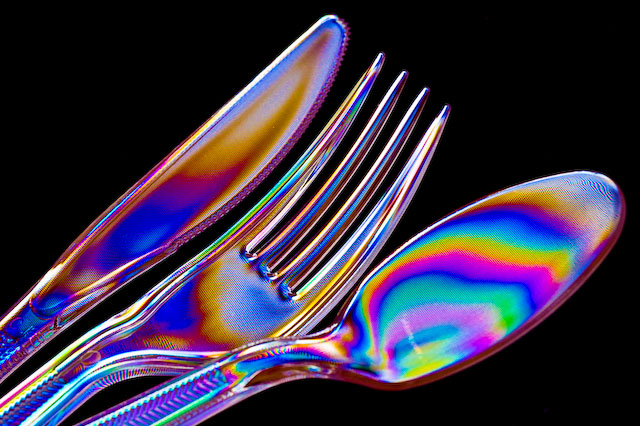
I didn't vote the macro challenge so this is the first time I've seen your image. My first impressions are that the idea is very creative, the lighting is well done but the composition (arrangement of the plastic ware) could have been stronger. There is also a weird pixilation contained within the very vivid colors. Was this from the post processing or an effect of the polarizing filter? I also think that your score suffered a little bit for not being "macro" enough. A very creative image that might have scored closer to 6 if entered into a challenge with a theme related to colors or silverware.
Feel free to send me a PM if you have any questions regarding this critique.
Tim
|





 Add photograph to your favorites
 Add photographer to your favorites


 Photographer found comment helpful.


