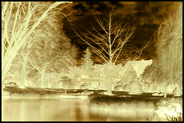
This is an IR shot that I processed like a normal color IR image, but then inverted. I don't know if people will get it or even like it, but I didn't see any IR shots in the last 'Negative Image' challenge, so I thought I'd try something new.
I like how it looks like a vandyke brownprint...
---Post---
Oh well, I guess people didn't like it. The composition is straight out of late 19th century romantic landscape theory, but minus the ornamental classical building on the other side of the pond.
At least I had better luck with this than I do with actual van dikes...try as I might to prevent bleach back with a goldtoner, I still lose alot more tone in the fix and final wash than I would like.
Statistics
Place: 255 out of 355 Avg (all users): 4.9933 Avg (commenters): 0.0000 Avg (participants): 4.7838 Avg (non-participants): 5.1974 Views since voting: 702 Views during voting: 213 Votes: 150 Comments: 1 Favorites: 0






 Add photograph to your favorites
 Add photographer to your favorites


 Photographer found comment helpful.