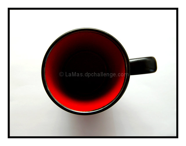
There's something very appealing about the black circle of the cup surrounded by the black square of the frame - this works very well to keep the supposedly "boring" centered comp from being so.
I find myself wishing the handle was pointing directly at the 3 o'clock position, rather than just above. But the colours and lighting are just great.....very effective
I really like the lighting on this, it makes the cup look bottomless. The red color realy works well and while I'm not a fan of frames I think it also works well with this photo. Well done.
I know it is just a cup, but it impressed me. I don't know if its the shadows, the black frame matching the outside of the cup, or the combination of white, black and red! I liked your work a lot! 9






 Add photograph to your favorites
 Add photographer to your favorites

 Photographer found comment helpful.


