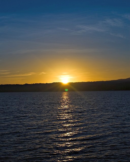
I'd say that while it fit the challenge, centered was not the way to go with this shot. Moving the horizon down would have helped. A polarizer would have helped with the lens flare which would get rid of the green spot. Make sure your lens is clean too. Oil from your fingers will create flares like that too. (I'm painfully aware that I am bad for that). Its too bad there wasn't more symetry in the hills as it does (as mentioned previously) really add to the feeling that this isn't level.
One thing to try would be a narrow vertical crop. The reflection in the water creates nice leading lines to the sun but it would be more apparent with a tighter crop. Yes, landscapes aren't usually in portrait orientation but then they are generally composed centrally either.
There's not much I can say that hasn't been already said, but I can offer you my first impressions: nothing here grabs me or pulls me in. The colours, although nice, are nothing special, neither is the composition, the setting, the processing or anything else. I bet every member on DPC has at least a few shots like this on their hard disk somewhere. The thing that bugs me though is that is does have potential and a little pre-planning, post-processing could have capitalised on that.
For example, by moving the horizon line up or down by about 20-25% you would make a clear subject out of the sky or the sea, whichever you choose. I persoannly find central crops boring as hell to look at. Also, if you had put the sun at maybe one of the rule of thirds intersections, the composition might be a little more interesting and not just a basic snapshot.
The processing: I appreciate that in basic there's not so much you can do with the green spot, but since it's now out of the challenge you can do whatever you want to the picture. Just black it out with the brush. Also, it looks like there's a whole host of detail in the clouds and some cool formations that are swamped in the meaningless blue, if they could be brought out (maybe with shadow/highlights?) then again, it would be a bit more interesting. You could probably bring them out with some nimble control of the curves command too. I don't mind the colours though, they're quite nice... but i can see mroe things I would change with this picture than more things I would keep.
I saw your thread in the forums and wanted to give your shot a bit more evaluation.
First impression:
A pretty scene with possibilities. The fact that it is a basic sunset will not give you much by way of score at DPC. Viewers/ voters are expecting to be wowed by the quality of the scene as well as the quality and imagination of the image. I have personally entered many 'nice' shots in challenges that get sorely beaten in voting. The image you have is a nice scene but one that does not scream at me - "WOW this is awesome"!
Positives:
The sky and the clouds have the potential to really take this shot up a notch or two. A bit of Shadow/highlight adjustments in PS could really define the sky more and provide more interest to the shot. You could emphasize the textures of the sky while maintaining the nice water reflections.
It is a serene and inviting location - I would love to be there to witness the sunset.
Issues that others have mentioned:
1. The unfortunate lens reflection (green spot) is extremely distracting in this image. The green dot looks like a mistake not a benefit to the photo - and the DPC voters (including me) dropped their score because of it. If this was an advanced editing challenge, you could have removed it in post processing. But alas, so here we are! Was your lens covered with a UV or other filter? The more glass you have in front of the sensor, the more chance for these unfortunate lens artifacts.
2. The subject (the Sun) is not well defined but merely a 'blob of light' as opposed to a clear sharp shape. Many voters including me were likely saying - yes it is centered, but what is drawing me into the shot?
3. The tilted horizon does add a bit of unbalance to the image. DPCers are picky and if the horizon is planned to be flat, it should be flat.
4. The main subject of the shot does not appear to be centered completely. With the horizon below center, the sky appears to dominate and gives the impression of not being centered.
Putting together the green lens artifact, the unlevel horizon and the blob of light as the subject, and the impression of not being centered, voters were not going to reward the image with a high score (and remember around here anything over a 5 is considered a high score!). I personally gave it a 4 because I saw more issues than positives.
Very nice idea- but cutting a landscape in half is kind of a sin on photography unless you have the subject to pull it off. The glare spot is distracting as well. It is very hard to photograph the sun head on like that. I think is was a worthy attempt though.







 Add photograph to your favorites
 Add photographer to your favorites

 Photographer found comment helpful.


