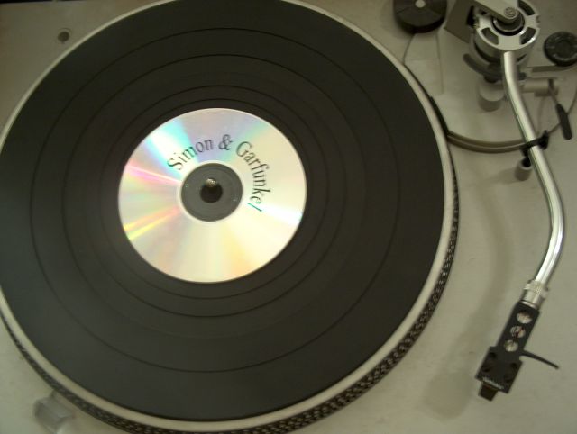
:)) very funny idea. i had to think for a sec to understand the catch
but it's too blurred...
very nice title correlated to the image ... what a pity it's not clear enough
I like the idea. It is extremely important in pictures in which there are writings in the center of interest that those are really in focus. The eye feels horribly distracted if they aren't.
very out of focus, not a very interesting direction of view. That combined makes it not even very obvious right away that the CD is not a record label.
If this picture were in focus, AND, you used a CD that had more art work on the label so it stood out as a CD and didn't look like a normal record lable on a vinyl record, AND you took the picture from an interesting angle, and the picture had some color or 'life' to it ........ you would have probably won this challenge. You had an awesome idea here - but you picture looks like a bad B&W from the 1950's.
Sorry but I can't find much good to say about this photo. Focus is off, it seems a bit underexposed and I have no idea what is "out of place" about this.
I'd like to see this sharper - a tripod would have helped. Also, in the upper left corner, the bit of black is distracting. Good idea for "out of place", though.







 Add photograph to your favorites
 Add photographer to your favorites


 Photographer found comment helpful.


