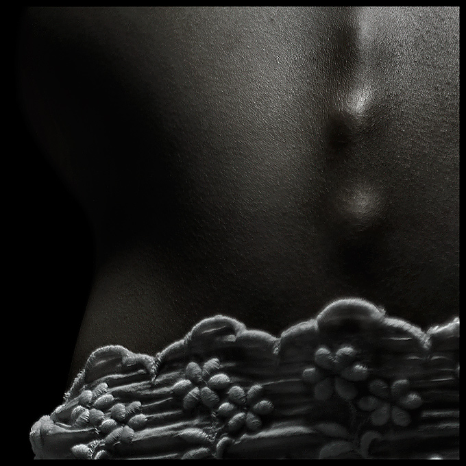
This is my friend dana who has a very interesting protruding spine so we thought it was very appropriate for the challenge. The lacy cloth is actually just part of her top that she lifted up. So what you see is actually rotated upside down.
Cropped, rotated, then I did a lot of contrast enhancing adjustments (soft light, curves, multiply, etc). as well as lot of stuff to save some blown out highlights (shadow/highlight, burn). I then converted it to blakc and white and downed the opacity to desaturate and darken her skin. Finally I abused Noise Ninja to soften the harshness from all the editing. Then some USM... which I should've done BEFORE I added the border. -_- oh well too lazy to reedit.
Lit with a desktop lamp in my dorm.
Post Challenge:
In retrospect, I probably should've bumped up the ISO and used a smaller aperture since the foreground bokeh bothered a lot of people.
but... it's her shirt, NOT an underwear. jeez.
Thanks for all the encouraging comments!
Statistics
Place: 35 out of 156 Avg (all users): 6.0800 Avg (commenters): 7.6667 Avg (participants): 5.8125 Avg (non-participants): 6.2059 Views since voting: 1567 Views during voting: 383 Votes: 200 Comments: 25 Favorites: 5 (view)
Nice sensuality to this. DOF is possibly shallower than it needed to be - for my own preference, I find myself wanting to see the bit of clothing just below the vertebrae in sharper focus, to go along with the apparent sharpness in the rest of the clothing to the left. Nevertheless, I like this a lot, and think it's a strong submission. 9
i really dont know what to say about thiis photo i love the sharpness the com is great, i would only say the flowers to the right are a little blurry but other then that i love it great job
I -love- the subtlty of the subject, and i like the way the lacing complements it with light & shadows! :) very beautifully done, the dark background is a bonus; I can't wait to see where this ends up- I bet it will be in the top 5 or so :) -- beautiful! :) ~~10~~
I think the light and shadow on the spine is great. I really don't think the cloth at the bottom helps at all--I think your lighting was stong enough on the spine to have it stand alone. The cloth is a bit out of focus and to me an unneeded distration.
wow. very subtle image. I like the tones and textures. I'm having trouble with a critique because I do find the flowers to be distracting and more the main subject; but if you were to take them away the image wouldn't stand on it's own. Perhaps a more simple accessory would have done the trick. Like a sash...






 Add photograph to your favorites
 Add photographer to your favorites

 Photographer found comment helpful.


